authorized crew only
sequence XB-900
The Training Notebook launched in 2012 to help personal trainers move beyond spreadsheets and pen-and-paper tracking. Returning full-time in 2024, the app had become unstable due to vendor issues and was missing functionality that trainers now expected. A full redesign was required to restore reliability and expand core features.
I led user research, mapped trainer workflows, designed wireframes and high-fidelity screens, and conducted usability testing across the redesign. I collaborated closely with developers throughout the build and am also a part owner of the product.
Worked with a product manager, project owner, dev lead, and developers. Tools included Figma, Axure RP, Google Sheets, and Typeform.
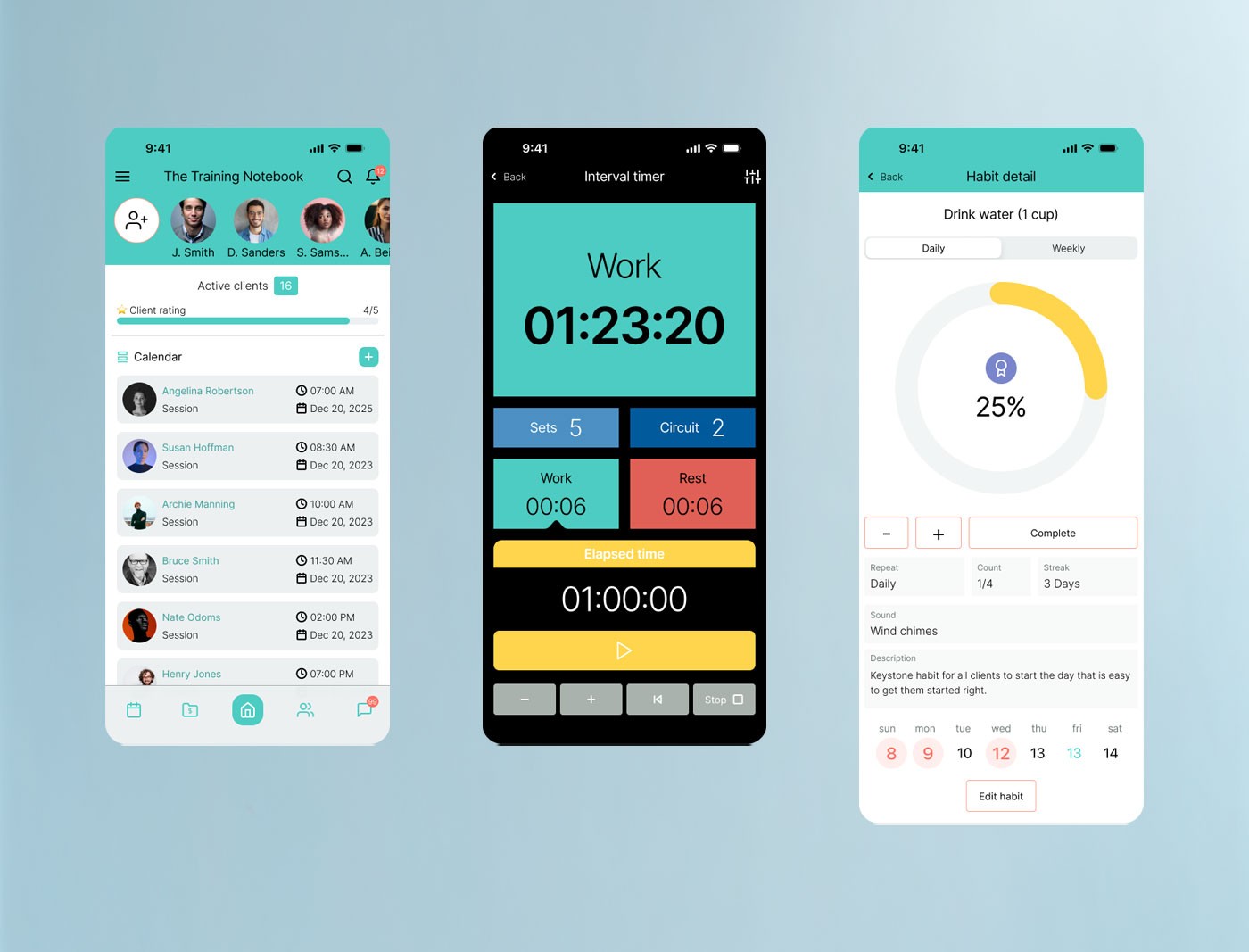
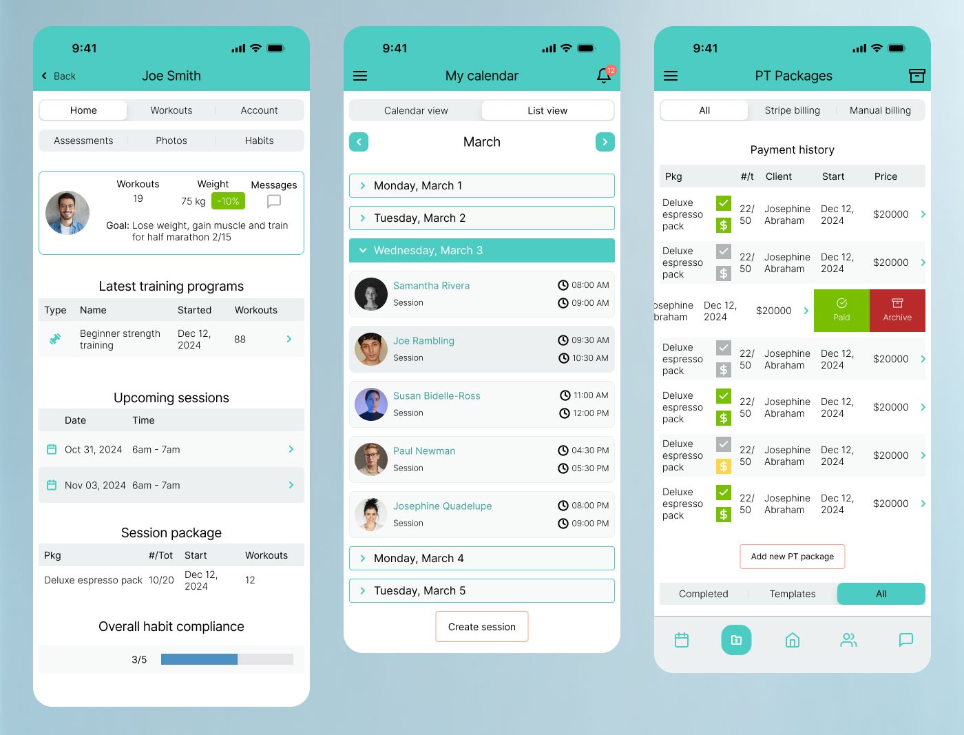
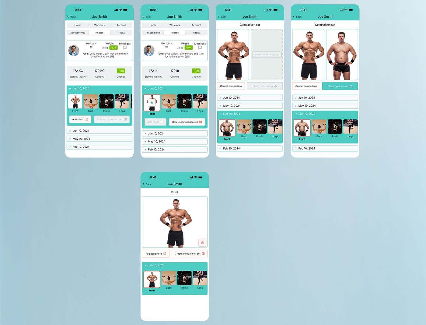
FigThree core screens of the redesigned Training Notebook — the client and calendar dashboard, an in-session interval timer, and the habit detail view for tracking client accountability.
Without a clear product strategy, redesign efforts risked misalignment with both user and business needs. Expanding features without defined goals could lead to wasted effort, rework, and a product that failed to improve on its predecessor.
I created a product strategy worksheet with the product owner to capture goals, evolving trainer expectations, key problems, assumptions, and hypotheses. This structured foundation guided prioritization and kept design decisions anchored to measurable outcomes.
The strategy aligned the team early, reduced the risk of scope creep, and established clear benchmarks for validating success through research and iteration throughout the project.
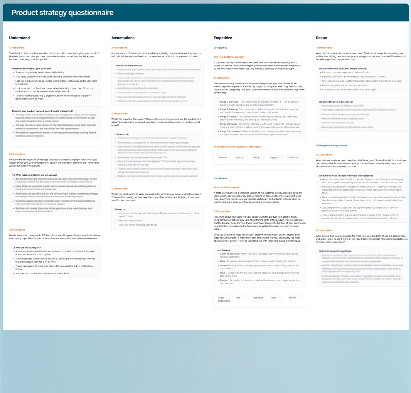
FigProduct strategy questionnaire and feature analysis matrix.
Trainer expectations had evolved significantly since the app's original launch. Beyond basic stability, trainers needed better onboarding flows, faster session documentation, flexible scheduling, and customizable client intake — none of which the existing version supported well.
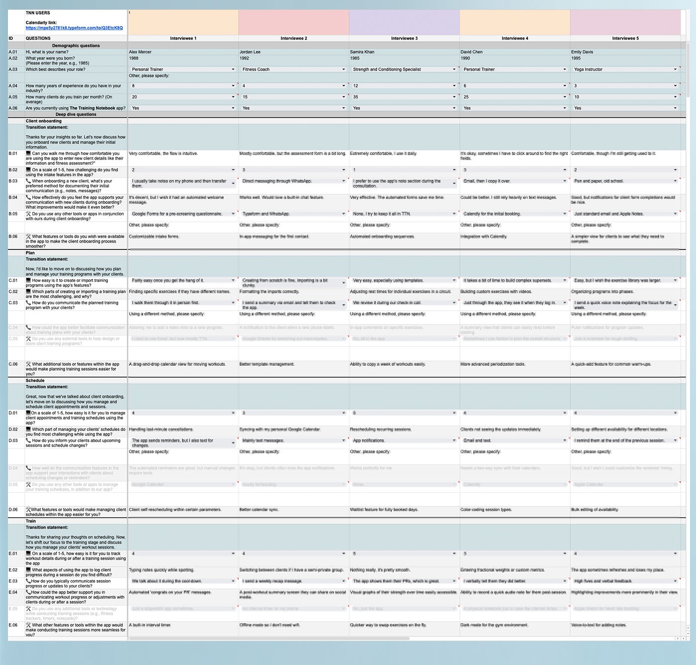
I interviewed active users and collaborated with an experienced personal trainer to formalize insights. Worksheets and surveys helped map goals, pain points, and behaviors, grounding feature decisions in real workflows rather than assumptions.
Research revealed critical gaps in onboarding, program setup, and the ability to make real-time session changes. Trainers consistently emphasized the need for speed and flexibility — any friction during a live session was unacceptable. Findings were formalized into a trainer persona, consolidating recurring patterns across participants into a single representative archetype used to anchor design decisions throughout the project.
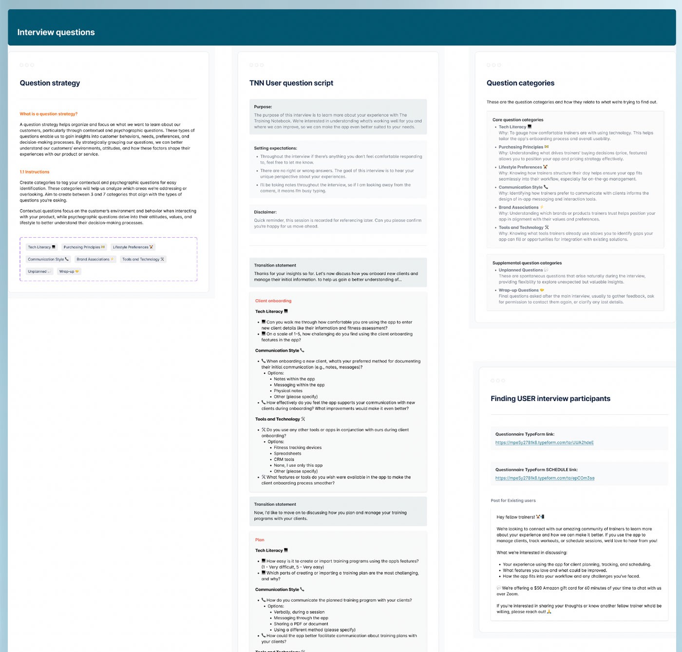
FigUser interview framework — covering question strategy, the full TTN user interview script, question categories, and participant recruitment criteria.
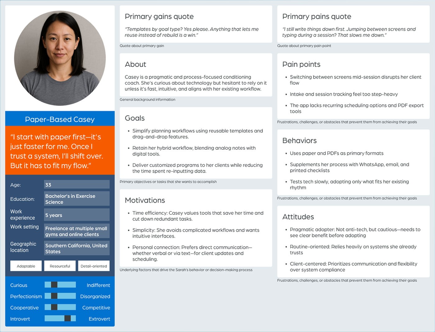
FigTrainer persona — Paper-Based Casey. A high-volume trainer managing 35+ clients across multiple locations, relying on paper templates and manual scheduling due to frustration with overly complex app interfaces.
After interviews were complete, every response was logged to a synthesis board question by question, with each participant color-coded so individual answers could be tracked across the group. Similar answers were clustered together — turning qualitative observations into something quantifiable, where each cluster showed not just what trainers said, but how consistently they said it.
Each cluster was then mapped to the relevant stage in the trainer's workflow and tagged: insight, opportunity, tool friction, or communication gap. Those patterns were used to develop basic personas and a set of gain creators and pain relievers that defined the redesign's direction and kept scope tied to real trainer needs rather than assumptions.
Features were extracted from those recommendations and plotted on an impact/effort prioritization matrix. That gave the team a clear, defensible basis for defining MVP scope, staging future development phases, and making every feature decision traceable back to real trainer feedback.
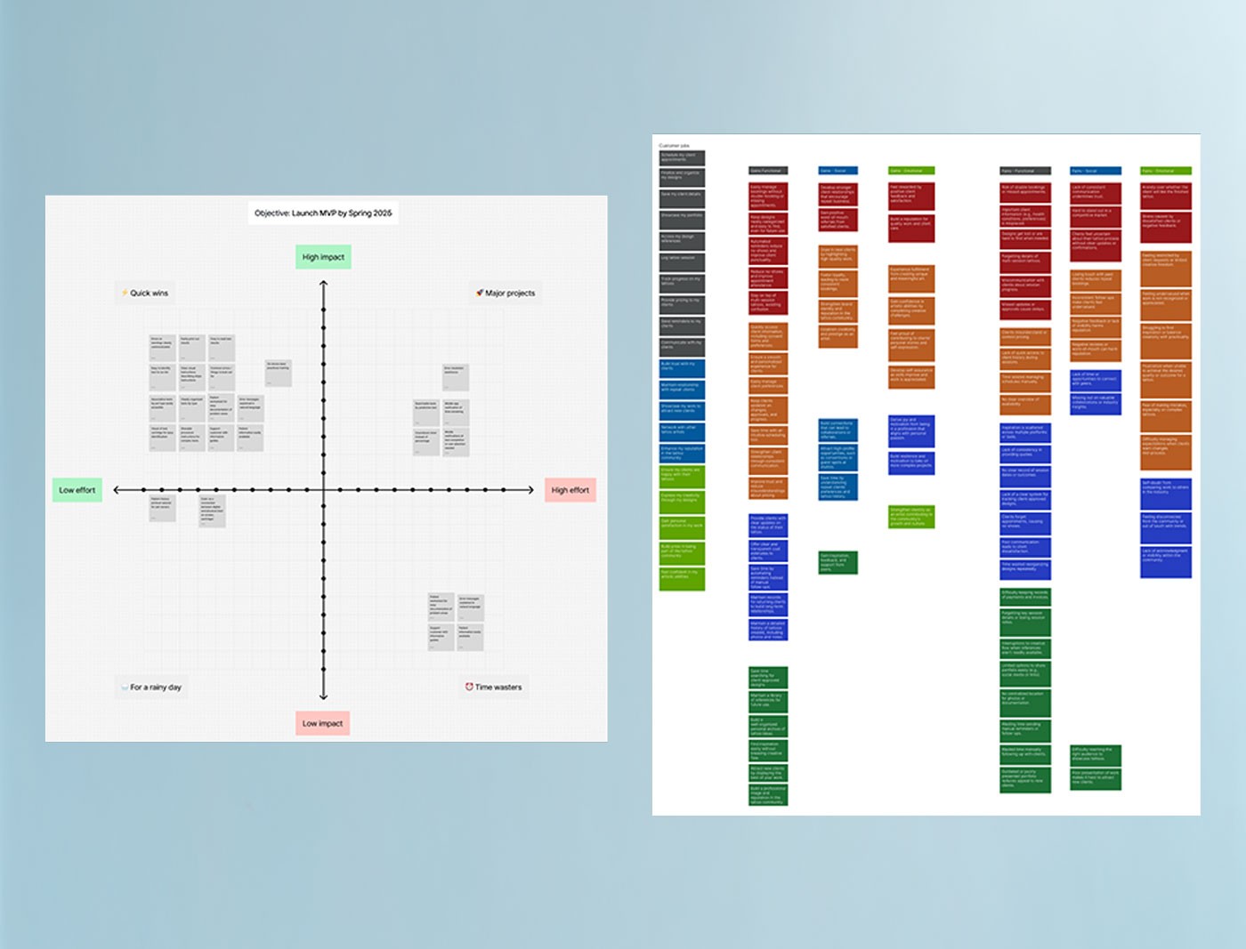
FigResearch synthesis board (right) — interview responses logged by question, clustered by theme, and color-coded by participant, then mapped to journey stage and tagged as insights, opportunities, tool friction, or communication gaps. The impact/effort matrix (left) translated those findings into a scoped, staged MVP feature set.
A stable, high-quality build required handoff materials that left nothing to interpretation. Working with an offshore development team meant documentation had to be thorough enough to prevent misalignment without requiring constant back-and-forth during active development.
I created complete user flows covering all screens, states, and edge cases across every major feature. Components were systematized into a reusable design library, and interaction behaviors were annotated directly within the flows. Post-delivery QA was conducted through annotated screen comparisons and tracked via Jira tickets.
This approach reduced developer guesswork, shortened review cycles, and maintained visual and functional consistency across the app. The systematized components also supported future feature expansion without requiring major restructuring of the design.
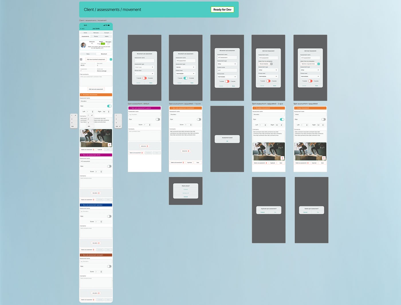
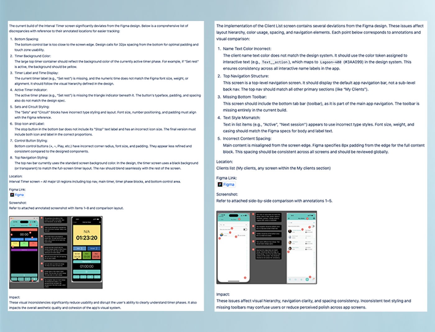
FigUser flows and QA annotation review — from annotated screen flows to post-delivery issue tracking.
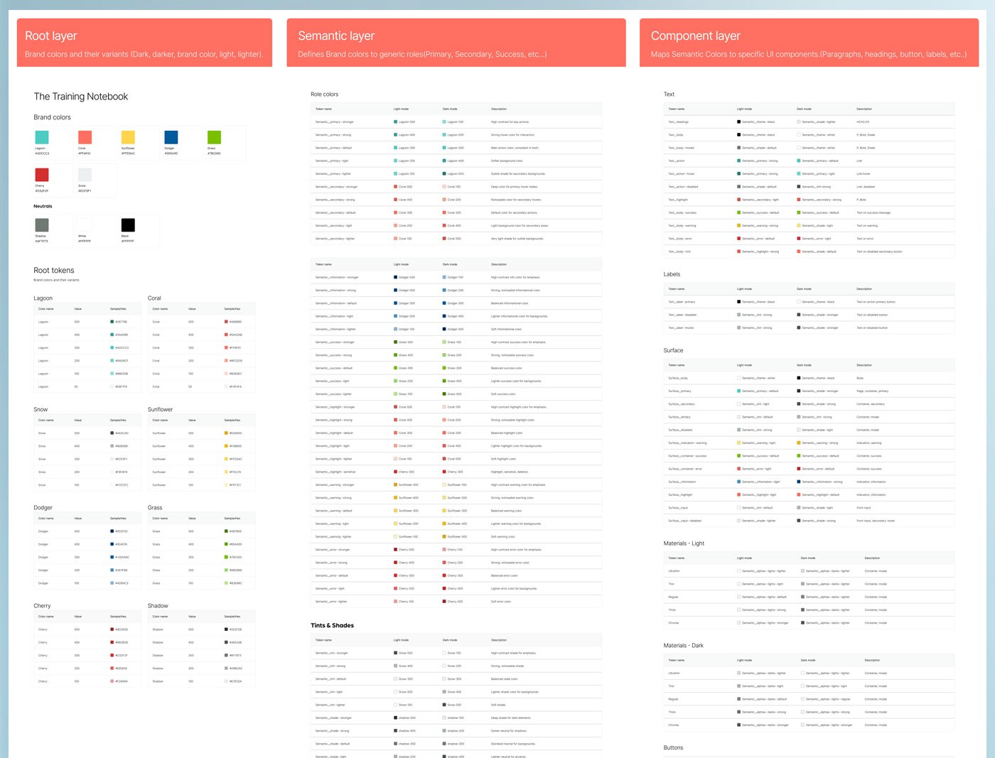
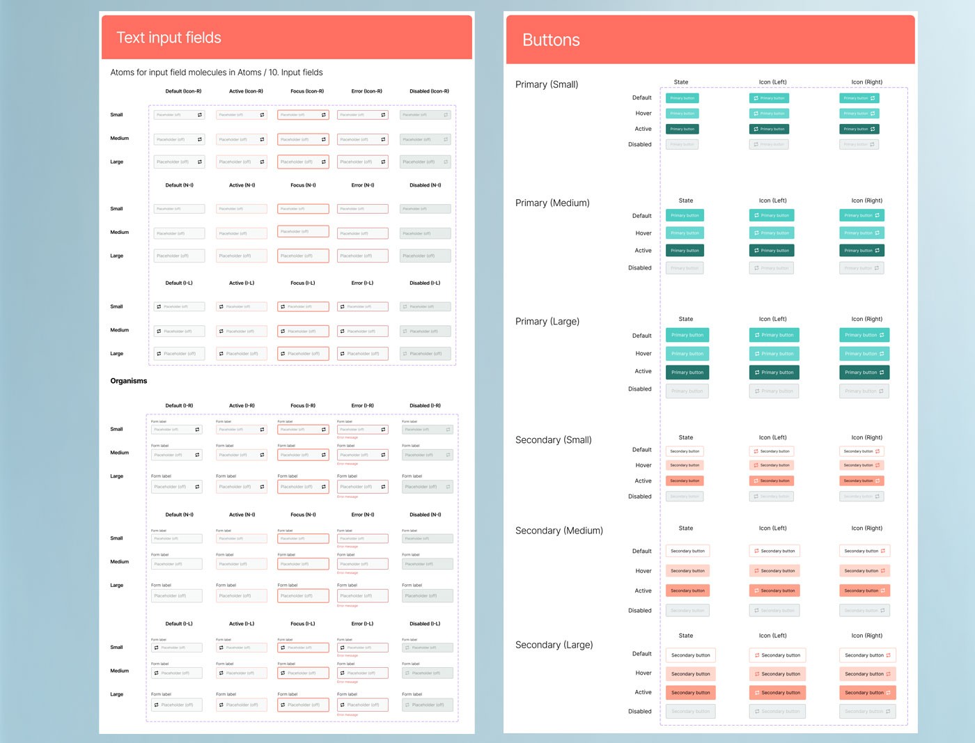
FigDesign token system and component library — the systematic deliverables underpinning the Training Notebook's visual consistency.
Refining complex flows early in the process significantly improved clarity and reduced downstream effort. Strong organization, consistent communication with developers, and a structured design system were critical to keeping the project on track. Every hour spent on documentation up front saved multiple hours of back-and-forth during development.
Clear documentation, in-depth walkthroughs with developers, detailed interaction diagrams, and disciplined use of atomic design methodology ensured alignment across the team and execution quality throughout the build. Owning the product gave me additional perspective on every tradeoff.
The redesign launched with minimal revisions required after handoff. A client-facing companion version was also developed alongside the trainer app, and early user testing validated both the design direction and the underlying information architecture.