authorized crew only
sequence XB-900
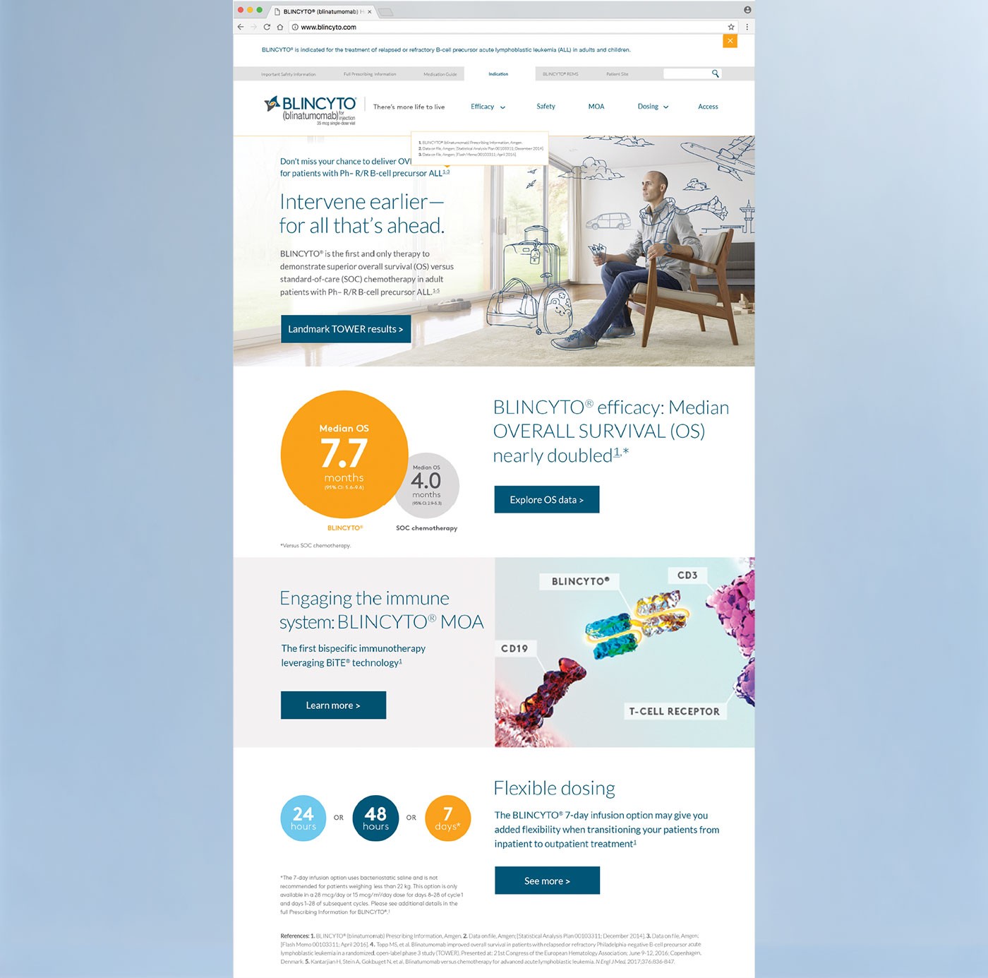
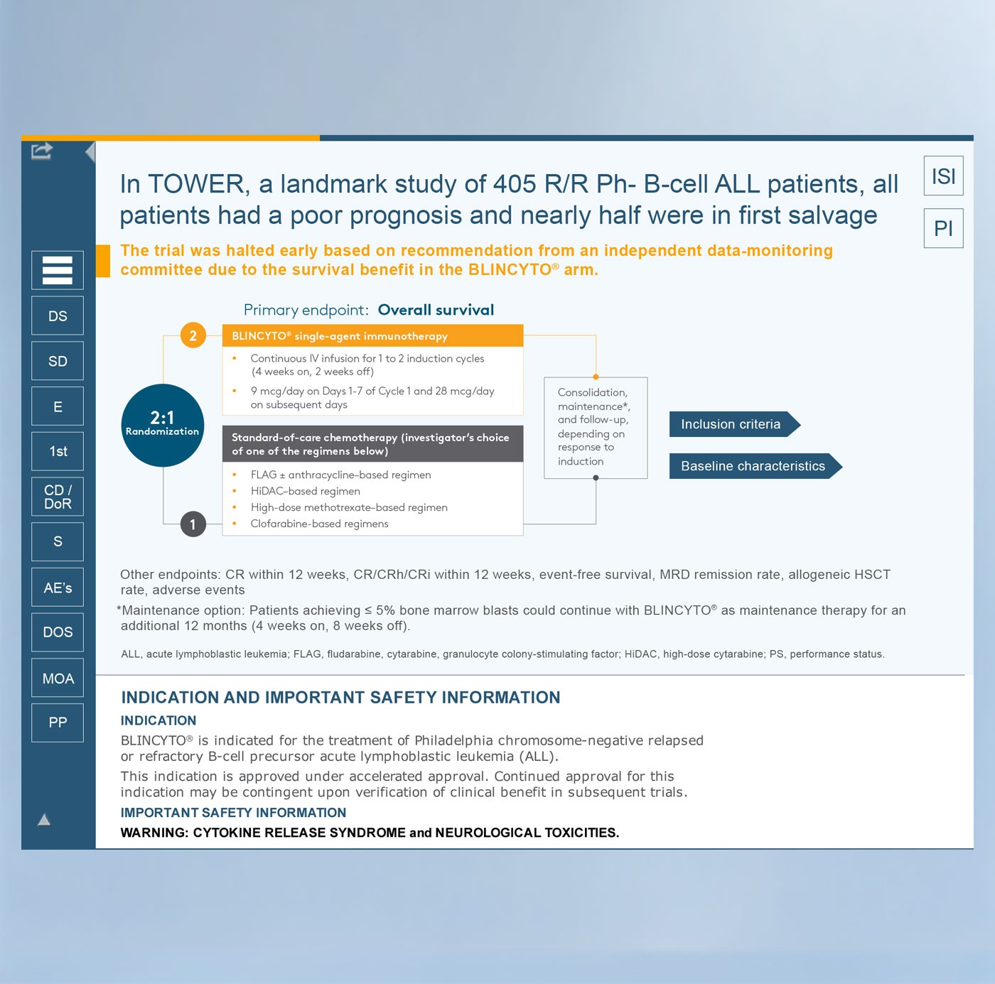
FigFinal deliverables — the BLINCYTO HCP website and iCVA interactive sales aid.
Legacy field reps were abandoning the iPad-based sales aid in favor of printed materials. The experience felt outdated and disconnected from the brand. Meanwhile, two new websites — one for HCPs and one for patients — were being built alongside the iCVA redesign. All three needed to align visually and structurally to support the product's launch and brand consistency — without compromising regulatory compliance.
I led UX and UI design across the interactive sales aid and two responsive websites. I conducted research, created wireframes, prototyped in Axure, and ran usability testing. I redesigned the iVA within Veeva, ensuring compatibility with field workflows and regulatory standards. I collaborated closely with legal, content, and dev teams to ensure the tools were intuitive, compliant, and aligned across channels.
Worked with a cross-functional team: one PM, a business analyst, a dev lead, content strategist, and two legal-focused copywriters. I used Axure RP for wireframes, prototypes designed in Photoshop, Veeva CRM for testing and deployment, and spreadsheets organizing feedback.
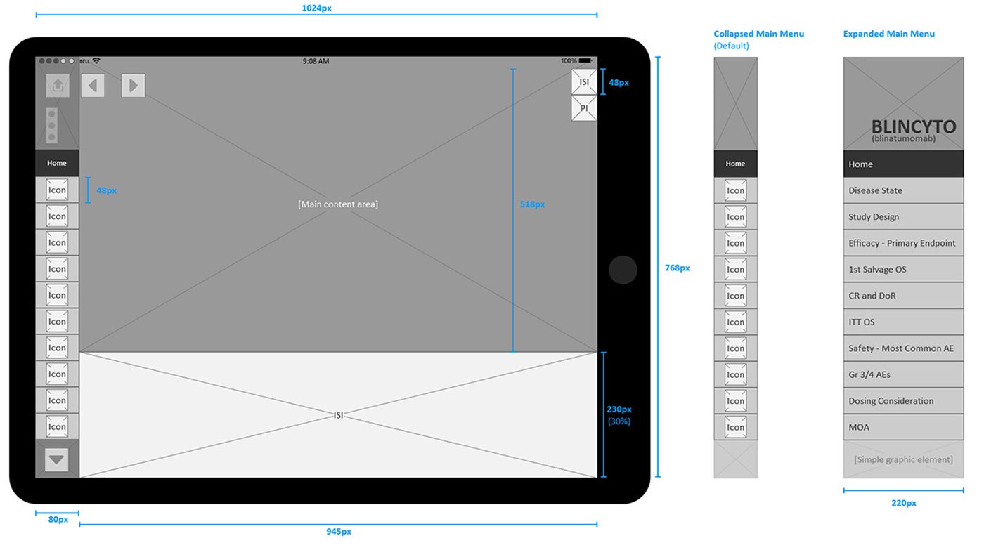
FigiCVA layout wireframe — specifying the 1024px tablet viewport, collapsed and expanded navigation states, ISI footer proportion, and content area dimensions.
Sales reps continued to rely on physical printouts instead of the digital iCVA tool. With limited access to reps and tight deadlines, we had to plan carefully and conduct much of our research independently — studying the product content, understanding sales workflows, and preparing targeted questions to make the most of the short interviews we could schedule.
I prepared proto-personas, user journeys, and a Value Proposition Canvas to hypothesize goals, pain points, and motivations. Interviews focused on how reps used the physical CVA and why they avoided the digital one. Key friction points emerged: small font sizes, accidental taps, and difficulty locating slides quickly. These insights helped frame design strategy and content restructuring.
Interviews revealed gaps between the digital tool and how reps actually presented. We flattened the navigation to reduce time-to-information and streamlined it to maximize presentation space, knowing reps were already fluent in the material. By trimming unused content and mirroring the intuitive flow of the physical version, we delivered a digital tool that felt both practical and natural to use.
Sales reps had varied and sometimes contradictory feedback. Some prioritized visual clarity and confidence in front of clients, while others needed flexible access to slides or preferred the physical version. We needed to distill these findings into a clear content strategy and scalable information architecture — without losing nuance.
We translated user insights into structured tools like the Value Proposition Canvas to organize gains, pains, and jobs to be done. Then, through card sorting exercises and collaborative workshops, we restructured the slide content around real-world selling scenarios. I mapped out the new architecture to reflect how reps navigated information live, reducing overwhelm and surfacing high-utility content faster.
The resulting sitemap and slide flow prioritized the most-used content while minimizing distractions. It reduced visual clutter, clarified groupings, and aligned the material with how reps guided conversations. This strategic foundation ensured the digital version felt familiar to existing users — while clearly improving usability.
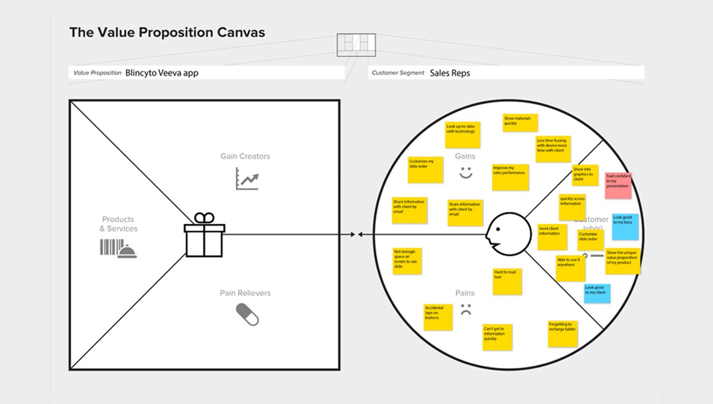
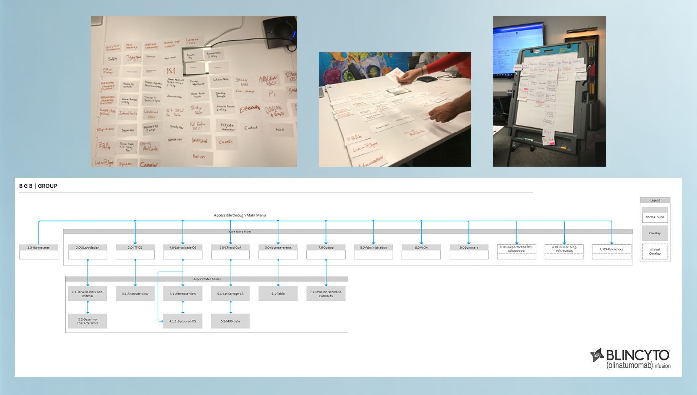
FigValue Proposition Canvas and IA synthesis — translating rep insights into a structured content strategy.
Both the iCVA and websites were regulated pharma tools with no room for ambiguity. With a remote dev team and strict launch timelines, documentation had to be airtight. The internal team in India required clear specs, with delays from misalignment carrying high financial and legal risks. Every asset — mobile, tablet, or desktop — had to meet FDA expectations, support consistent ISI/PI placement, and match brand architecture exactly.
I annotated every screen state, behavior, and interaction, anticipating developer questions before they arose. For the websites, I mapped desktop/mobile flows, flagged responsive behavior, and detailed ISI/PI behavior. For the iCVA app, I clarified tap targets, content rules, and screen hierarchy. Everything was reviewed in PDF and internally approved — minimizing confusion and ensuring consistency across Veeva and web deliverables.
The off-shore team executed without needing clarification. My documentation enabled near-silent handoff, with only minor revisions post-delivery. Despite the complexity of two platforms, the final products launched cleanly, with regulatory sign-off and client satisfaction across the board.
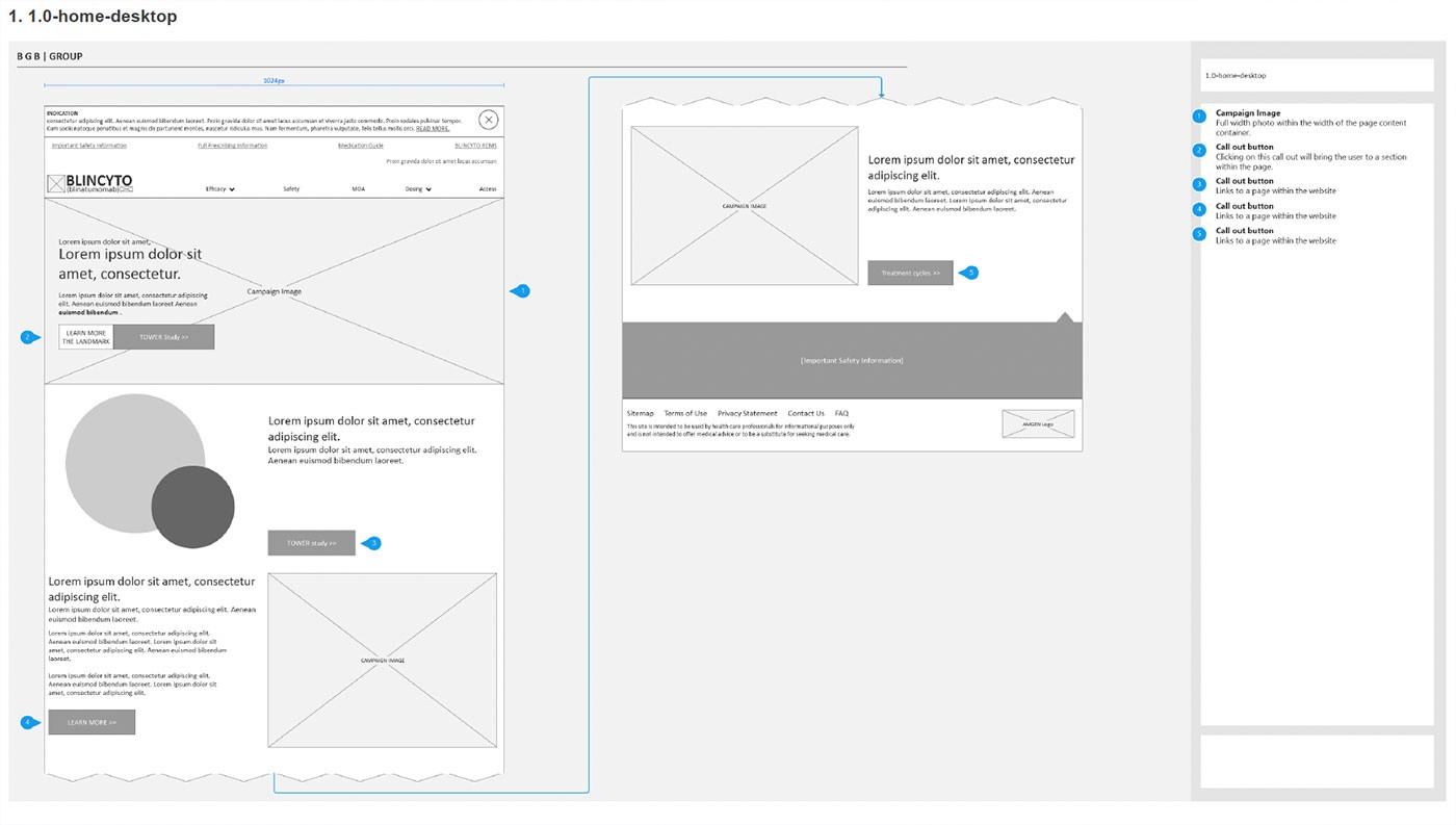
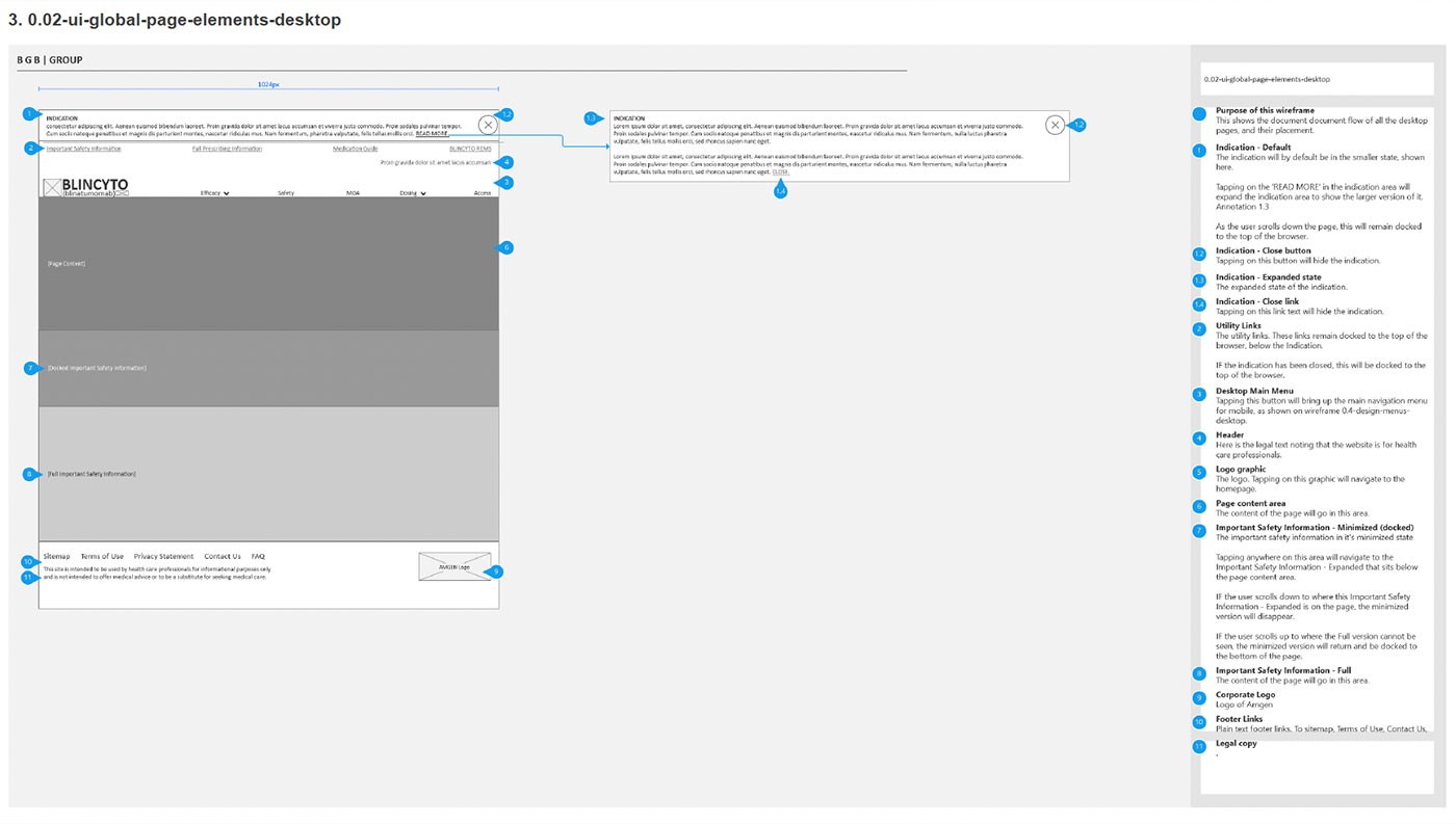
FigAnnotated wireframes and developer specifications ensuring compliant, consistent implementation across desktop and mobile.
The elements that made this project successful — navigation clarity, design consistency, and thorough documentation — reinforced principles I now apply to every project. Staying focused on the end-user drove every decision. I questioned how the design would perform once launched — would it make sense at a glance, or require effort to learn? That discipline created tools field reps actually wanted to use.
The final design delivered on the intended messaging and met tight deadlines. The client has continued using the same design for future updates — demonstrating long-term effectiveness and design quality that outlasted the original project.