authorized crew only
sequence XB-900
Like a chef's mise-en-scène — where every tool and ingredient is prepared in advance — a design system brings structure to the design process. Building DS2 became an exercise in handling tactical decisions upfront so that future work could focus entirely on solving real problems and maintaining alignment across products.
Without a system, patterns and components were being rebuilt from scratch on every project — creating friction, inconsistency, and wasted effort. The goal was a system that improved consistency, accelerated workflow, and could evolve over time without requiring fundamental restructuring.
I led the entire effort as a solo designer — acting as researcher, strategist, designer, documenter, and maintainer. Tools included Figma, Google Sheets, ChatGPT for accessibility and token planning, and Photoshop and Adobe Color for palette refinement.
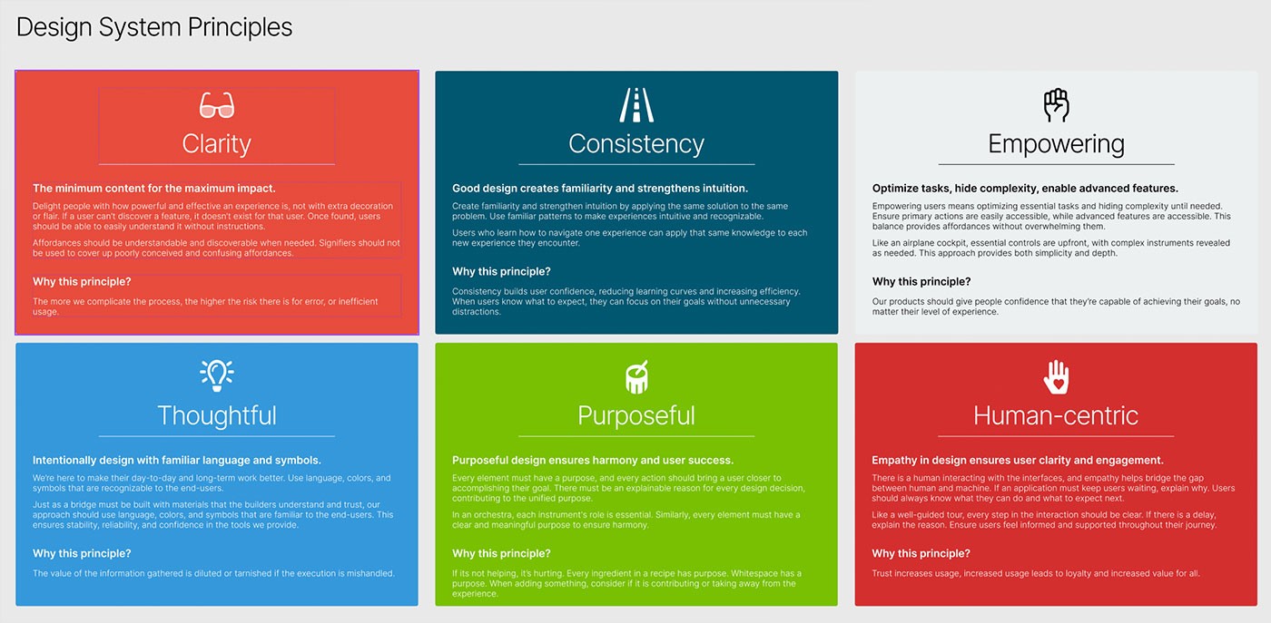
FigDesign system principles — six guiding values (Clarity, Consistency, Empowering, Thoughtful, Purposeful, Human-centric) defined at the foundation of DS2 to align every design decision with product intent.
Design systems risk becoming disconnected style guides — visually consistent but functionally disconnected from the products they're meant to serve. For this system to hold up under real usage, it needed to reflect deeper product and brand values, not just surface-level visual rules.
I mapped tokens, components, and interaction patterns directly to brand principles — clarity, thoughtfulness, and consistency across contexts. Typography, spacing, and hierarchy were chosen to reinforce these values functionally, not just aesthetically, so every design decision traced back to something intentional.
The system became a framework for consistent expression across products — reducing ambiguity when making design decisions, and enabling the team to move faster without revisiting foundational choices on each project.
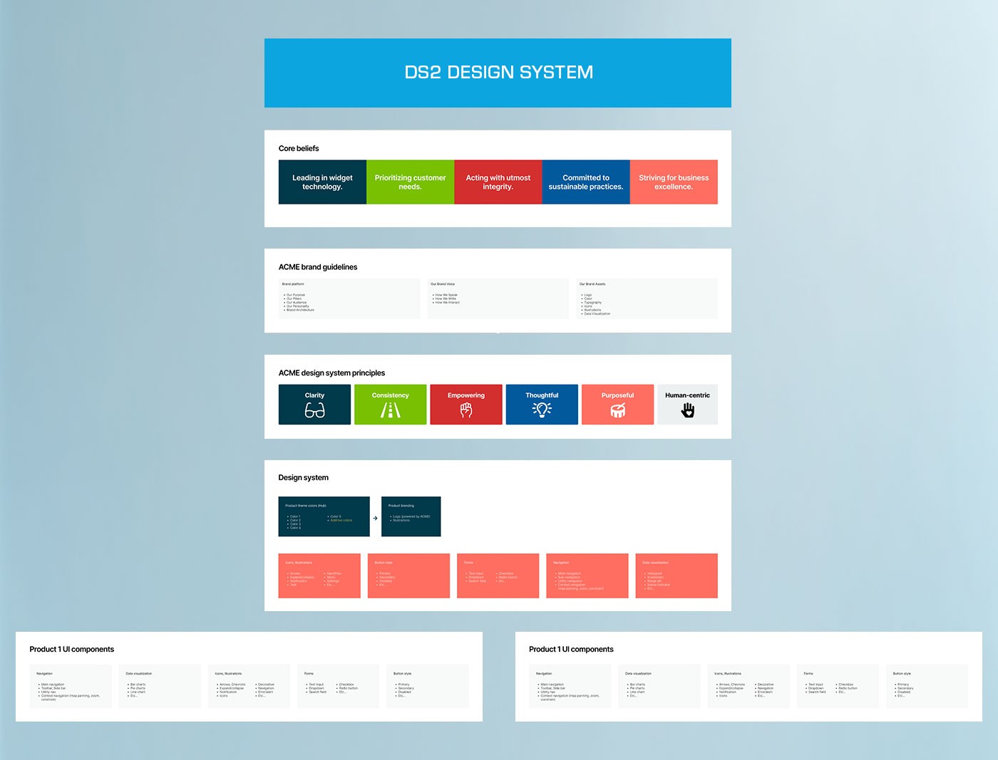
FigSystem foundation — core brand beliefs and guidelines cascade through design principles into the component library, showing how strategic intent shapes the full design system output.
Translating abstract design tokens into flexible, usable components required defining how layout, interaction, and visual systems worked together — not as isolated rules but as a coherent whole with predictable behavior across contexts.
I established grid, spacing, and motion systems first, then built components — buttons, inputs, cards, toolbars — using semantic tokens at every layer. Each component was documented with all variants and states, with responsiveness and dark mode considered from the start rather than layered in after the fact.
The resulting system was modular and context-aware. Components could be deployed across different products without modification, maintenance was predictable, and design decisions were grounded in the system rather than improvised case by case.
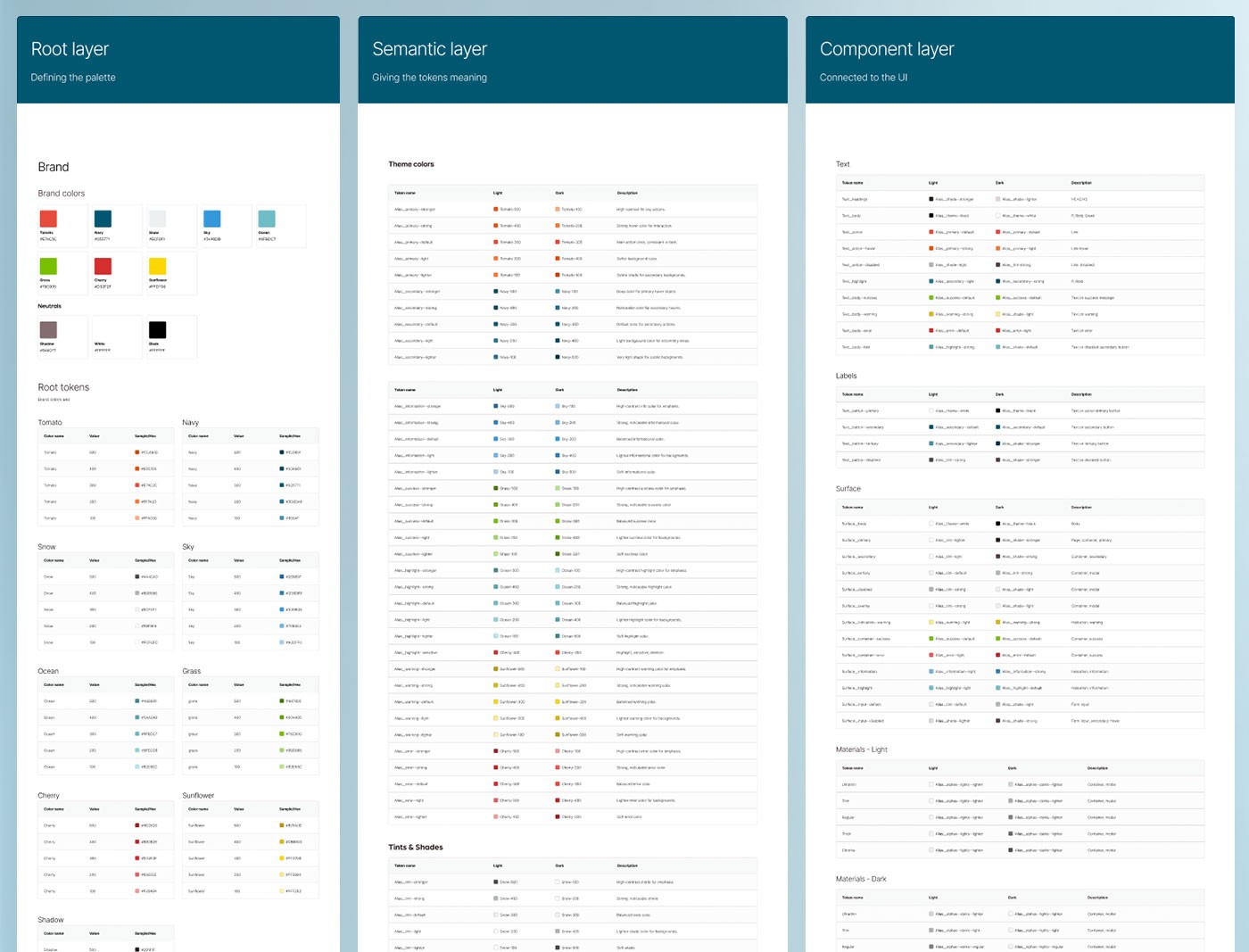
FigThree-layer token architecture — Root tokens define the raw color palette, Semantic tokens assign meaning and context, and Component tokens connect directly to the UI, creating a system that scales without breaking.
A design system without clear documentation is just a folder of components. Without structure, designers default to improvising and the system's value erodes — different people using the same components in incompatible ways, with no shared reference to resolve conflicts.
I structured everything within a single Figma file: token layers (Root, Semantic, Component) using Variables; reusable style libraries for text, color, grid, and effects; an atomic structure (Atoms, Molecules, Organisms); and BEM-inspired naming conventions applied consistently throughout.
The system became easy to navigate, onboard, and scale. New collaborators could find what they needed without a walkthrough, and the structure reduced friction across both design and development workflows without requiring ongoing explanation.
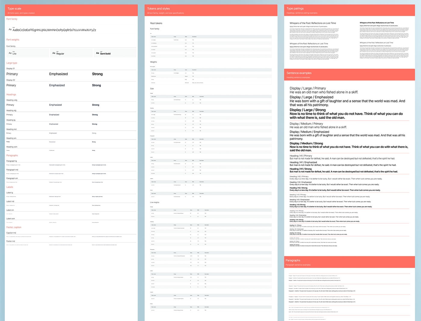
FigTypography system documentation — type scale, token references, and specimen pairings across display, heading, paragraph, label, and caption roles, covering light and dark theme usage.
Design systems often fail during handoff — either too abstract for developers to implement consistently, or too rigid to adapt when engineering constraints emerge. Getting the system to the development side required the same level of rigor applied to the design side.
I built a centralized Figma system that documented tokens, components, and interaction rules in full. Components used Variants to cover all relevant states. Tokens were structured across primitive, semantic, and component layers. Accessibility and responsiveness were validated throughout — not addressed at the end.
The system was modular, scalable, and developer-friendly. It reduced ambiguity during implementation, supported consistent output across products, and made onboarding new developers straightforward without extended back-and-forth.
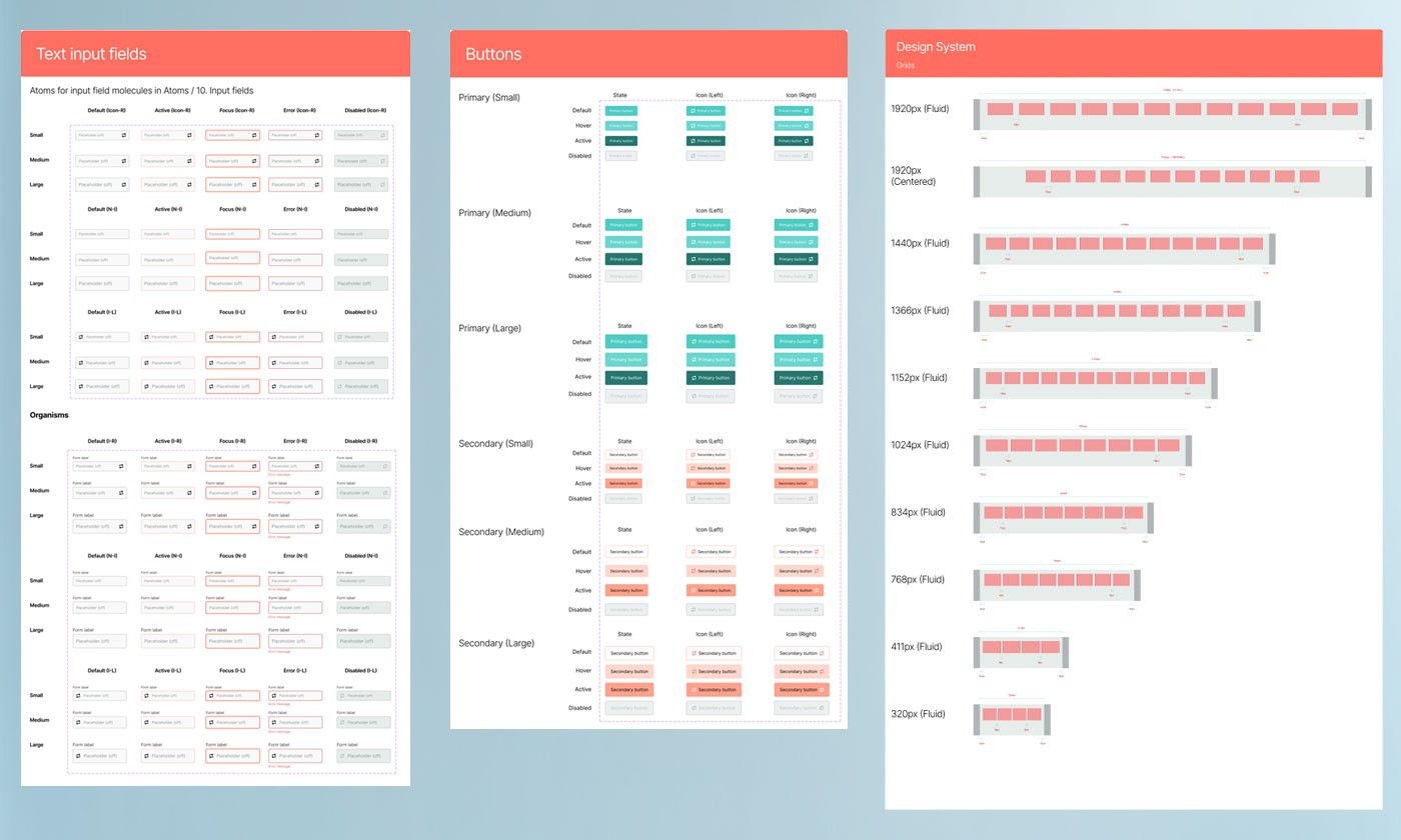
FigDeveloper-ready components — text input atoms, molecules, and organisms across all states and sizes; button variants at three scales; and responsive grid breakpoints from 320px to 1920px.
Building from foundational elements upward — and testing against real UI scenarios — was critical. Applying the system to actual products quickly separated what was theoretically sound from what was practically useful. Theory without application produces systems that look complete but fail under real conditions.
Keeping documentation inside the same Figma file as the components eliminated the drift that happens when documentation lives separately. Naming conventions and atomic structure gave new users a clear mental model from day one, reducing the learning curve significantly.
The system saved measurable time across design and development, held up under real usage conditions, and provides a flexible foundation that can be extended as product needs evolve without requiring the underlying architecture to change.