authorized crew only
sequence XB-900
FigProfile view showing KOL insights, activity tracking, and engagement tools.
Stakeholders had ambitious goals: create a highly customizable platform that tracked and mapped key opinion leaders (KOLs) in healthcare. However, much of the product vision lived informally in their heads, making requirements vague. Additionally, the complexity of the platform risked overwhelming users if not carefully structured.
I led user research, user experience design, wireframing, UI design, and usability testing. I translated stakeholder goals into clear user journeys, mapped out the information architecture, and designed scalable interface patterns to support both flexibility and usability.
Worked with a small cross-functional team: PM, dev lead, and two business analysts. Designed and prototyped using Axure RP, with supplemental work in Photoshop and Illustrator. My work ensured designs were aligned with technical realities and stakeholder needs throughout.
The product vision and business logic largely existed informally in stakeholder conversations, not formal documentation. Requirements were often expressed from an insider's view, making it difficult to translate them into intuitive user needs. The platform's customization capabilities also risked making the experience too complex if not carefully structured.
I facilitated discovery sessions with stakeholders, focusing on surfacing core user tasks rather than listing feature requests. I asked high-level questions to uncover real-world data flows and organized user needs into logical groups. These conversations informed early wireframes, information architecture, and user journeys — creating structure without sacrificing flexibility.
This approach turned scattered business goals into clear user flows. Weekly working sessions allowed stakeholders to validate concepts early, minimizing rework. The result was a practical framework balancing flexibility with clarity.
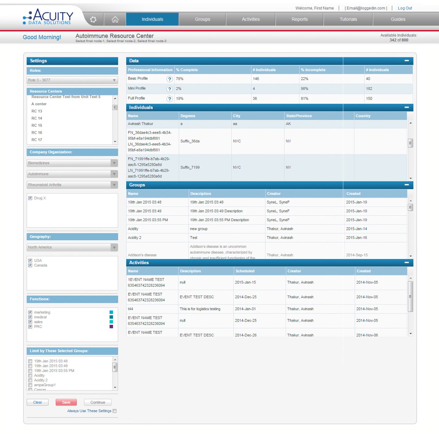
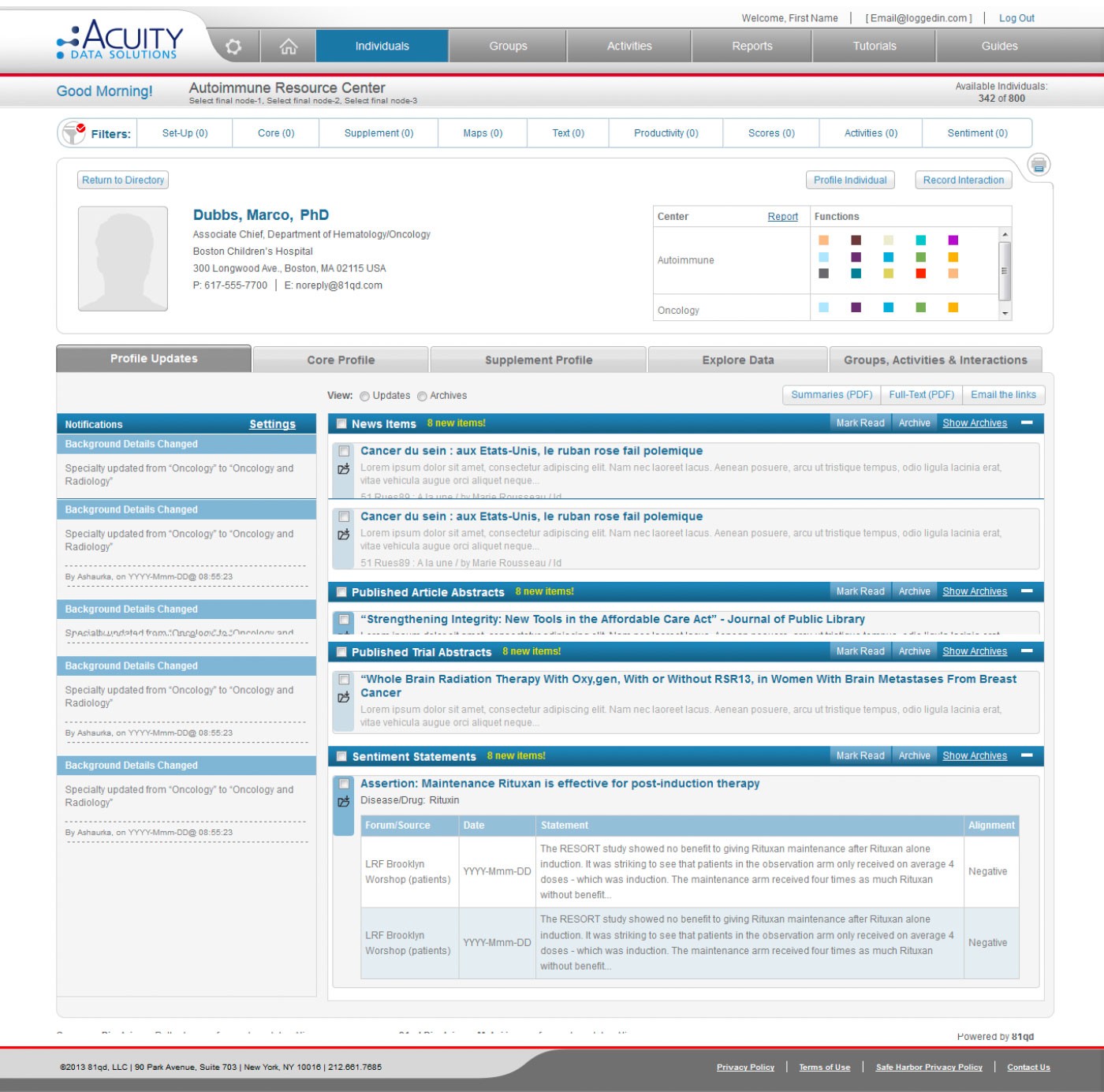
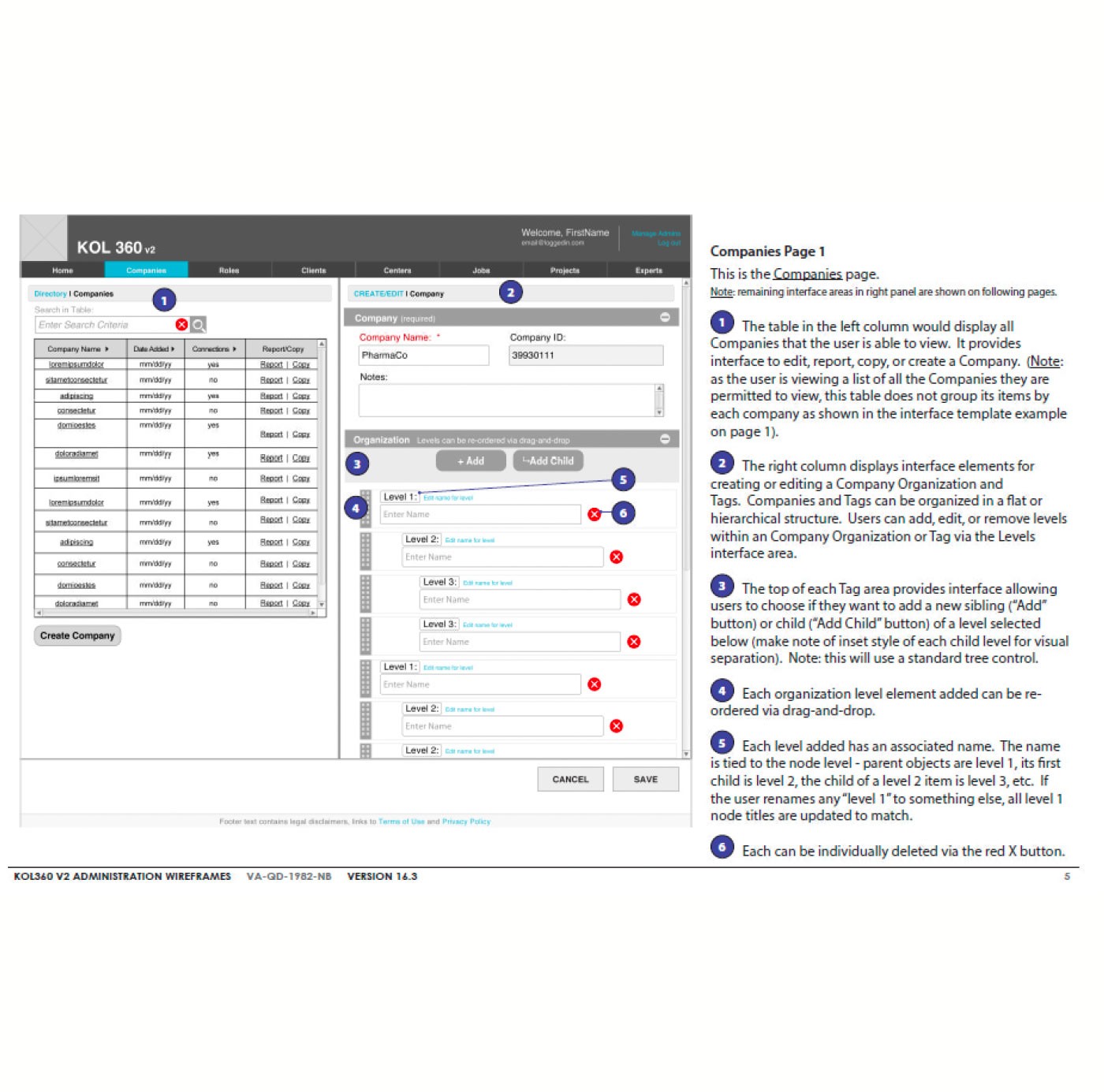
FigWireframe and final design for browsing individuals and viewing associated groups and activities.
Acuity required two tightly connected products: a user-facing portal for mapping KOL relationships and an admin portal for managing underlying data. Both needed alignment while serving different behaviors. Admin tools risked becoming overly complex without strong design guardrails.
I designed modular page patterns that flexed across both portals without fragmenting the experience. For the user-facing portal, I prioritized search, filtering, and relationship visualization. For the admin portal, I streamlined workflows like user role management, content editing, and custom data fields. Each page was fully annotated to minimize ambiguity and ensure scalable handoff.
Both portals maintained consistent hierarchy, visual language, and navigation logic, reducing confusion and development complexity. Documentation enabled clean handoff with minimal revisions. Continuous collaboration with development ensured alignment. The structure supported scaling across multiple pharma clients.
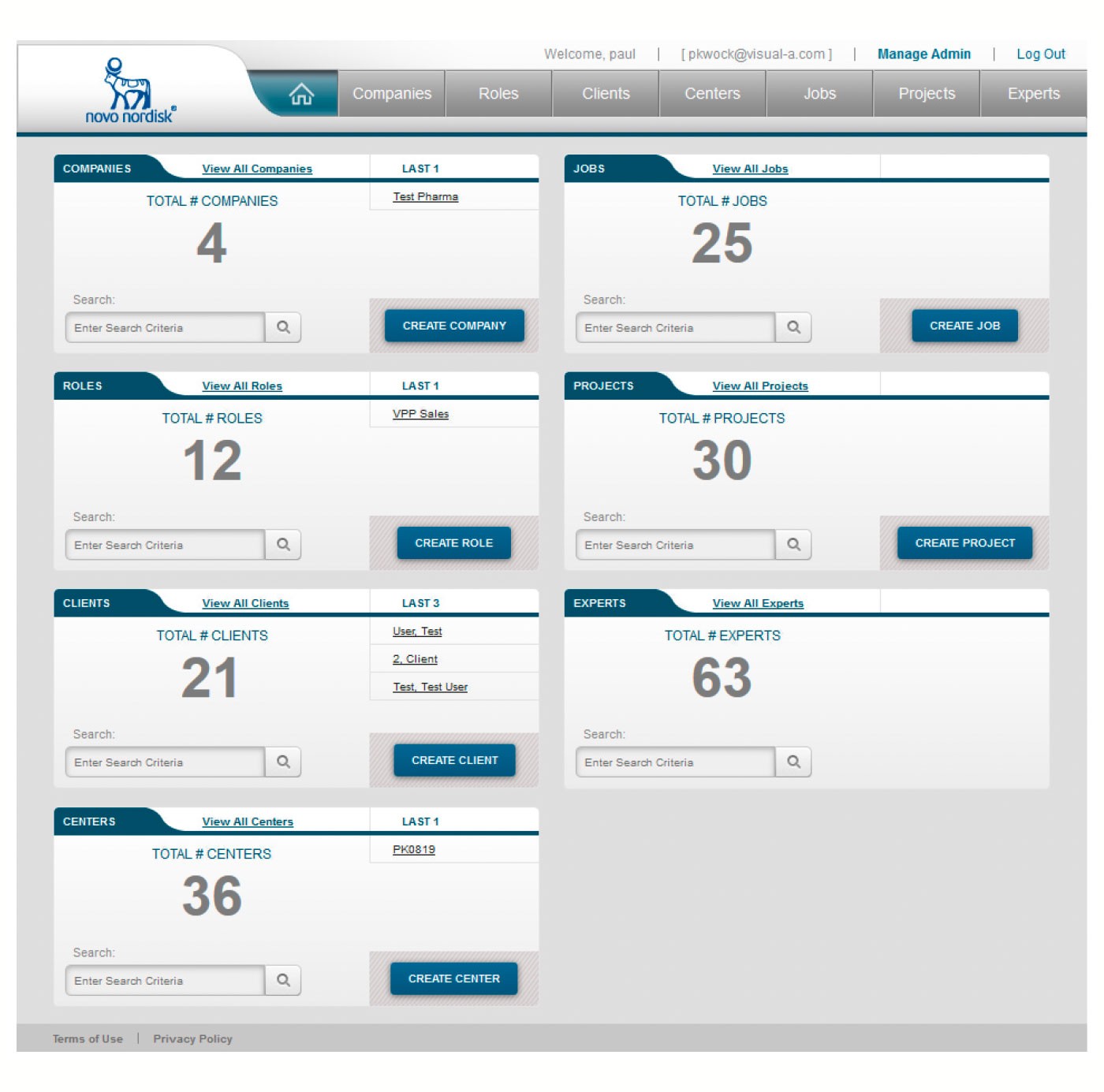
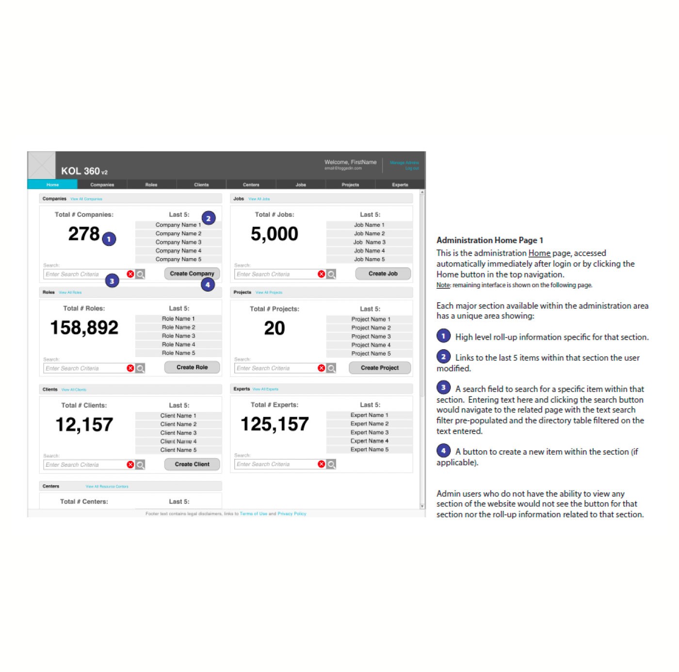
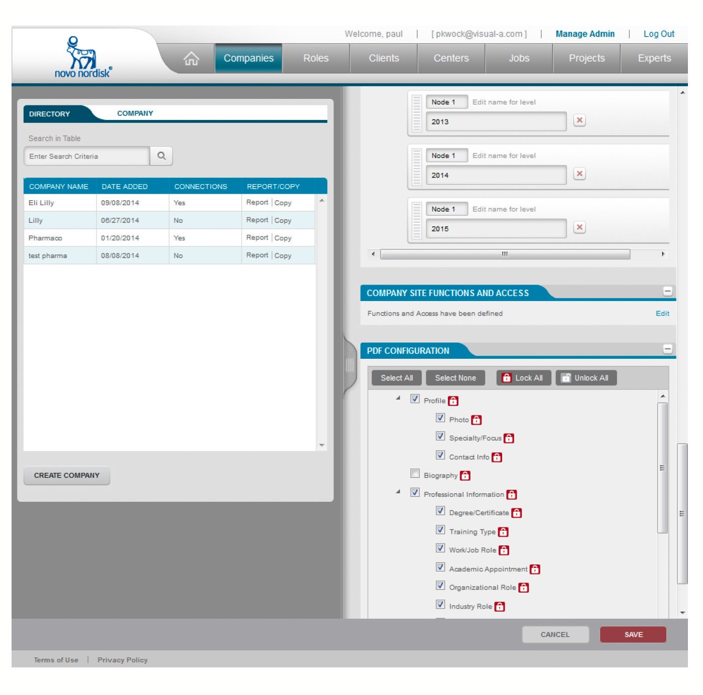
FigAdmin dashboard and system views for managing organizations, roles, relationships, and workflows.
Focusing on clarity first — organizing ambiguity into structured flows — was critical. Surfacing assumptions early and validating them with stakeholders reduced churn later in design and development. Careful documentation minimized downstream risks, supporting a smooth offshore development process. Building both a user portal and admin portal within a modular design system reinforced the importance of visual alignment across parallel workstreams.
The final designs translated stakeholder goals into a buildable, scalable system. The structure and workflows delivered were strong enough to support platform expansion across multiple pharma clients.